
How to elevate visual storytelling with Nano Banana Pro
Combine a simple prompt with a detailed voice note. Run this in three tabs to find the best variation, then continue the conversation in that winning thread to build a consistent visual library.

Short on time? I get it. Here is the entire step-by-step guide summarized in a single visual:

And yes, things are getting a little meta here. I used the exact method described in this article to generate the infographic that explains the method. It’s a bit of an Inception moment.
Want to see how this simple workflow turns a rambling voice note into a vision from the future, a cinematic storyboard, or a full customer journey map? Let’s dive in!
Meet Nano Banana Pro
I have a confession to make. I have a new daily obsession, and it honestly lights up my entire day. I take dense, complex text and convert it into beautiful illustrations using the Nano Banana Pro model. It’s a total thrill. My addiction started innocently enough, but now I can’t stop. I take a heavy concept or a messy idea. I feed it to the machine. Then I watch it turn into art. It changes how I work, and it makes the daily grind much more fun.
My fascination actually started years ago. I remember my early days as a product manager. I watched graphic facilitators in workshops. They fascinated me. They started with a blank page. They listened to our messy discussions. Then, they finished with something extremely beautiful. We would hang these posters in the office. The team looked at them with pride. It represented weeks of collective intelligence. It was a tangible vision that we could touch and see.
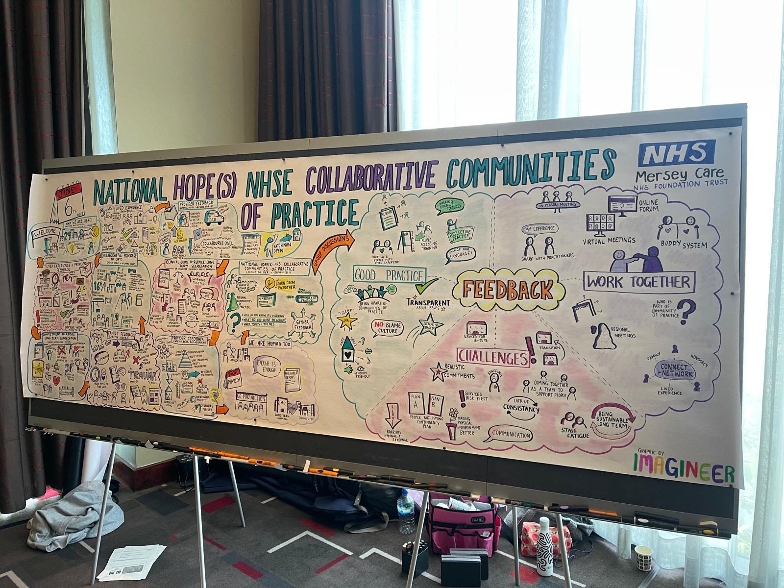
Just look at this result from The Big Picture Graphic Facilitation below. Isn't it beautiful?
These facilitators are usually generous people. They try to be good teachers. They always say the same thing: “Anyone can draw.” They claim all drawings have value. They even use icebreakers to prove it. Honestly? I never bought it. I struggled with that concept. My sketches help me understand a concept. They help me write documentation. But I would never hang my art on the office wall. I definitely wouldn’t want the whole company to see my stick figures.
But recently, everything changed. Thanks to Nano Banana Pro, I can actually manage. Look at what I did recently:


And I didn’t stop there. I actually went a little overboard. I generated more than 50 similar infographics. I organized all of them into a massive FigJam board:

Not bad, right? I had to explain product management concepts to a class of data science students. I didn’t want to use boring slides. I didn’t want to put them to sleep. So, I decided to make infographics instead. I admit it isn’t perfect. I would love to do this live in front of the students. I would love to capture their feedback in real-time like a true facilitator. It doesn’t replace that magic of collective intelligence building up on a whiteboard. But at least the result is visual. It helps people learn more efficiently.
I know it’s in French. I could have translated it into English for this article. But as you might have guessed, I have a slight problem: I’m addicted to creating these visuals. I hit the daily generation limits almost every single day. I often find myself waiting impatiently until 8 PM for the quota to reset. This happens even with the Gemini Pro subscription. Theoretically, the plan offers up to 100 images per day. But there is a little warning in the description: “image generation and editing is in high demand. Limits may change.” And I reach those limits very quickly.
Keep the prompt simple
And now, I want to show you exactly how I generated those specific infographics. Here is the prompt I used (translated for you):
I’m preparing a product management training for data scientists. For the presentation, instead of slides, I want you to generate graphic facilitation visuals. I will provide content section by section. I want you to generate a graphic facilitation image to cover all topics in that section.
Here is the content for this section:
---
[Here I activate the microphone and dictate all my notes...]
There is this very interesting article from Nicola Mattina that gives a specific method for writing prompts for Nano Banana Pro. It insists on a strict structure. You must first indicate the work surface. Then you define the layout. Then you list the specific components. Finally, you set the constraints.
This is excellent advice if you want a very specific, professional result like a comic strip. But honestly? I’m not that strict. My prompts are pretty trash. They are often messy and full of typos because I dictate them. I prefer to keep my prompts simple and open. I want the system to be creative. I don’t want to constrain it too much. I let the AI surprise me.
Let me share the details of my process with you.
Follow this simple process
My actual process is much messier:
I start by writing a short sentence about the visual result I want, just like I would ask a colleague.
Then, I type three dashes “---” to create a clear separation.
After that, I activate the microphone. This is where the magic happens. I launch into a monologue for 10 to 15 minutes. I tell the whole story. I explain the context, the nuances, and the details I want to capture. I might ramble a bit, but that density of information helps the model understand the vibe.
Once I run out of breath, I hit send.
Alternative for step 3: Sometimes, instead of activating the microphone, I simply copy-paste text directly from my documents. I don't dump the whole file, though. I am very precise: I select only the specific paragraphs that I want to see converted into the illustration.
And here is my secret for dealing with AI randomness. I open three separate tabs in my browser. I paste the exact same prompt into all three tabs and hit enter simultaneously. Since these systems are probabilistic, the results are rarely identical. Usually, one image is weird, one is okay, but one is genuinely cool. I pick the winner and close the other two tabs.
To prove this, let’s look at the results for that Inception infographic I shared at the very beginning of this article. I used the exact same prompt in three different tabs. Here is what I got:

You can see the difference. One was a bit chaotic (left), one was just meh (right), but the third one (middle) nailed the style. I didn’t change a single word of the prompt. I just rolled the dice three times.
I’ve found that iterating on a bad image is a waste of time. If it starts bad, it usually stays bad. It’s much more efficient to pick the best seed and continue the conversation in that specific tab. This ensures the style remains consistent for the next set of images.
So, once I have that cool result, I tell the system, “Okay, this is great! Can you do the same thing for the next part?” I put the three dashes “---” again, dictate the next piece of content, and keep the visual style consistent throughout the entire conversation.
Visualize your daily work
Create presentation slides
My addiction didn’t stop at colorful workshop posters. I realized I could apply this same lazy method to my daily work. I started creating presentation slides:

I personally love a high-contrast style. I ask for simple, black-and-white, graphic visuals. It looks sharp and professional on a big screen. I use the exact same three-tab method here. I dictate the concept of the slide, and I let the model handle the composition. Here is the prompt that generated it:
Create a simple infographic to present this text.
Style: Minimalist, simple, black and white. Make it look hand-drawn by a human to explain the concept to a non-tech audience. Put it in a rectangle with black borders. Be artistic and professional, not too cartoonish. Not too much text, just the essentials.
At the bottom, include: “Adam Faik - theaithinker.com”
It will be used in a Google Slide.
---
[Here I activate the microphone and dictate my notes...]
Illustrate your documentation
I also started using this for my written documentation and articles. You might have seen this one in my previous article about Gems:

And here is the prompt that generated it:
Create a simple infographic to explain this concept.
Style: Minimalist, simple, black and white, clear. Hand-drawn style, as if made by a human, to explain the concept to a non-technical audience.
It will be included in an article.
---
[Here I copy and paste the part of the article that I want to illustrate…]
Upgrade your napkin sketches
But the absolute coolest trick is the napkin sketch upgrade. Sometimes I just need to think with my hands. I draw a terrible sketch in my notebook. It’s messy, imperfect, and frankly ugly. Then, I take a photo of it. I upload it to the chat and simply ask the model to make this clean and professional. The result is great. It keeps the structure of my thought but applies a professional design layer on top.
Here is the raw input. As you can see, I am definitely not winning any art awards here:

And here is the output. It retained every bit of the structural logic but stripped away the mess:

I want to prove that this wasn’t the result of twenty iterations. Here is the actual chat interface showing it happened in a single turn:

And if you want to try this yourself, here is the prompt I used to get that result:
Create a simple infographic to explain the concept in the attached image.
Style: Minimalist, simple, black and white, clear. Use a hand-drawn style, as if made by a human, to explain the concept to a non-technical audience.
Add icons that make sense for each component. Clean up the layout with a perfect white background. Ensure the diagram is perfectly horizontal and centered.
It will be included in an article.
Explore a product case study
One last thing I did recently really sparked this whole experiment. I had to present a product strategy, and instead of a boring doc, I wrote it as a newspaper article from the future. It aligned stakeholders on the target vision. Since it’s confidential, I can’t share it here. But it made me think: How about using Nano Banana Pro for all the other visual artifacts product managers and designers need to do for their work?
That’s when I asked Gemini to list every possible visual artifact a product manager might need. The list was absolutely massive. I honestly had forgotten half of the things we are supposed to visualize. Here is the prompt I used to uncover that list (feel free to prompt it):
Product managers and designers often need to create visual artifacts: storyboards to explain flow, diagrams for workshops, prototypes, sketches, or even slides for training and communication.
Can you please list all the graphical assets that product managers and designers might need to create?
Group them by themes.
Be creative. For example, include things like a newspaper from the future to explain a product vision in a realistic way.
I wanted to test them all, but I ran into those pesky daily limits again. So, specifically for this article, I decided to narrow it down to one case study. I needed a product that everyone knows and a feature that is instantly understandable, so we don’t get bogged down in explaining the business context. Let’s pretend we are product managers at Netflix. We are working on a new feature called: random shuffle.
Imagine a user persona we all know very well. Let’s call him tired Tom. He has a few sitcoms he loves (Friends, The Office, How I Met). He has seen them a dozen times. He comes home from work, exhausted. He doesn’t want to decide. He doesn’t want to scroll. He just wants to click one button and have an episode start by magic.
Experiment with NotebookLM
First, I tried a quick and fun experiment. I asked Gemini to write a PRD for this feature. I exported it to Google Docs and imported it into NotebookLM. Then, I asked NotebookLM to generate the infographics directly.

Pro-tip: Just before generating, I clicked the little pencil icon to give specific instructions:

The results were surprisingly decent. For each example below, I have included the short custom prompt I added to customize the infographic. Here are some cool examples:
Step-by-step visual guide for onboarding new users.

The newspaper from the future: A realistic front-page layout dated 3-5 years in the future, featuring headlines about the product’s massive success. Great for setting a bold vision.

Business model canvas: A visual chart with elements describing a product’s value proposition, infrastructure, customers, and finances.

The north star slide: A single, high-impact graphic that simplifies the complex strategy into one memorable image or metric visualization.
 with the \"Solution & Impact\" (happy user) and a -40% playback time metric.")
Empathy maps: Visual quadrants (Says, Thinks, Does, Feels) often filled with sticky notes or sketches of user reactions.
 describing a tired user who just wants background noise.")
Customer journey maps: A timeline visualization showing the user’s emotional highs and lows, touchpoints, and friction areas across the experience.

Mood boards: Collages of textures, colors, interface examples, and photography to define the emotional feel of the product.

Crazy 8s and concept sketches: Rapid, rough hand-drawn UI concepts folded into eight sections of a paper.

Storyboards: Comic-strip style sketches illustrating a user’s specific problem (current state) or how they use the new solution (future state).

Mind Maps: Branching diagrams to organize thoughts, feature sets, or information architecture.

Mockups (Hi-Fi): Pixel-perfect static representations of the final design, including color, typography, and imagery.

Honestly, it’s amazing all the things you can get from just one single PRD. I generated a ton of other visuals, and the creativity of the designs is genuinely interesting. Sometimes it follows the Netflix visual identity, and other times it goes in a completely different direction. But you can clearly see the power here at least for finding new inspiration. If you want to explore all the results yourself:
However, NotebookLM has certain limitations:
Once you get a style you love, it’s hard to tell NotebookLM to do the exact same style again for the next image. You might need to download the image and re-upload it as a source to guide it.
NotebookLM is very creative. I would use it for vision work, things that are long-term, flexible, or inspiring. But I would not use it if I need something extremely precise or truthful. NotebookLM has a tendency to extrapolate.
This brings me to an important point: You really need to master your subject matter to use NotebookLM studio effectively and share the results. You have to review the output with extreme care. Otherwise, you risk being fooled by a result that looks convincing but is factually wrong.
I didn’t push this specific experiment to its absolute limit, but I’m sure there is a way to get incredible results with more detailed instructions. You could, for instance, upload NN/g guides as sources to teach the model best practices, or add more project documentation to provide richer context. The potential to have fun here is huge. But for now, let’s get back to Gemini, mostly because I personally love those little black-and-white, hand-made graphic facilitation sketches.
Visualize the product vision
Remember that newspaper from the future strategy I mentioned earlier? Let’s apply that exact technique here for this Netflix feature. Think of this as the Amazon press release method, but visual. It aligns stakeholders on the ultimate victory state before writing a single line of code.
I didn’t just ask for an image out of nowhere. I went back to my PRD conversation and asked Gemini to write the text of a 2027 press release first. Then, I took that text, opened a fresh chat, and used the following prompt to generate the artifact.
Act as a product manager at Netflix working on the new random shuffle feature.
Create a motivating newspaper front page from the future (like a press release) to show how this feature is a massive hit and how it helps people.
Goal: Make it motivating. Show the value of the feature and how it fits our strategy.
Visuals: Ensure the image is positive.
Text: I want to be able to read the headlines clearly to share this with stakeholders.
Use the context we just discussed regarding the PRD to fill in the details.
---
[Here I copied and pasted the text from the generated article…]
The result:

It sets the tone immediately. But a vision is just a dream without execution. Let’s leave the high-level strategy and get down to the details of the UX. Remember that massive list of visual artifacts I asked for earlier? I decided to build some of them. But here is where I got really lazy, in the best way possible.
I already had a conversation open where Gemini had written the PRD for the Netflix feature. It knew everything: the user personas, the pain points, the roadmap. Instead of re-explaining all of that or recording new voice notes, I just asked Gemini to generate the text content for each artifact in that original thread.
Generate the text for a Netflix empathy map.
Generate the text for a 12-month roadmap.
Then, I simply copied that text and pasted it into my visual generator tabs. I used the exact same 3-tab rule, but instead of my voice, I used Gemini’s own output as the context.
Create minimalist diagrams
Let’s start with the clean, black and white, hand-drawn style.
Can you please create a simple infographic to explain this concept.
Style: Minimalist, simple, black and white, white background, clear. Hand-made like made by a human to explain the concept.
Will be included in an article.
---
[Here I copied and pasted the text from the PRD conversation…]
For the subsequent images, I just typed in the same conversation:
Nice! Same for the next part:
---
[Next chunk of text…]
Here are the results:


Switch to workshop mode
After a while, I felt the black and white was getting a little repetitive. I wanted to see if I could shift the vibe to look like a real-time workshop. I switched the prompt in a new conversation to simulate a graphic facilitator drawing live during a design sprint.
I’m preparing a design sprint session for product people. For the facilitation, instead of slides, I want you to generate graphic facilitation visuals.
Act as an experienced graphic facilitator. I want you to generate a graphic facilitation image to cover all topics in that workshop.
Here is the content for this section:
---
[Here I copied and pasted the text from the PRD conversation…]
And the results:


 to backend server logic (Backstage) and API calls.")

 to the \"Value Map\" square (Pain Relievers, Gain Creators).")


And then... crash. I hit the daily image generation limit again. But I think you get the point. For this experiment, I sprinted through a dozen complex artifacts to test the limits and have some fun. In real life, I wouldn’t spam the model like this. I would generate one or two key visuals, like that empathy map or the vision poster, and really iterate on them to make them impactful.
But knowing that I can visualize an entire product strategy in minutes? That changes the game.
We used to be stuck with ugly stick figures or endless bullet points while waiting for the real designs to materialize. Now, the barrier between your ideas and the screen is gone. To be clear: this doesn’t replace the deep collaboration of a live workshop. But it does bridge the gap between a messy thought and a shared vision. It allows us to communicate faster, with more emotion, and honestly? It makes the daily grind incredibly fun. I can finally agree with those graphic facilitators from my early days: everyone can draw now. You just need raw ideas, a little AI assistance, and the willingness to experiment.
So here is my challenge to you. Pick one boring document you are working on today, a Jira ticket, a spec, a strategy memo, and try to replace 500 words of text with one visual. Don’t overthink the prompt. Just open three tabs, hit the microphone button, and ramble. Let the machine handle the pixels while you handle the vision. Trust me, once you start, you won’t be able to stop.